ComputerTalk, a B2B Rebrand
Lead the creation of the company’s branding guidelines to ensure consistency across all communications.
Overview
As ComputerTalk expand into new markets, they aim to strengthen brand recognition and awareness while maintaining consistency by leveraging existing brand colors and design elements. Without a brand guideline, they struggled to maintain visual cohesiveness across various platforms and communications.
💡 Challenge
How can the company stand out in a saturated market?
Through our research and internal discussions, we identified three key challenges
01
Brand Recognition
Inconsistent use of logos, colors, fonts, and messaging makes it difficult for customers to recognize and make a connection to the brand. The brand's visual and messaging elements varied across departments, often confusing prospects who were not familiar with the company.
02
Wasted Time
Teams across different functions often debated design choices or repeatedly revisematerials to achieve a coherent look and feel. This not only slowed down efforts but took up time and resources.
03
Difficulty in Scaling
As the company grows and expands into new markets, the absence of a guideline leads to further inconsistencies and confusion.
🔍 Research
Through feedback from teams internally, market research, and competitor analysis, we came up with a game plan.
Starting with… refining the company’s identity and values.
We kicked off the project with research — The goal was to refine the company’s identity, ensuring it aligned with its core values and vision. I conducted customer interviews and internal surveys to understand what made ComputerTalk unique, which laid the foundation for the branding guidelines.
Once our core values were clearly outlined, the next step—bringing it to life visually—became much more seamless. With a refined set of core values, we focused on making sure our visual elements effectively supported and reinforced them.
🚀 Results + outcomes
The introduction of a comprehensive brand guideline, reusable templates, and a cohesive design system transformed their brand identity and awareness. By aligning logos and standardizing design elements, we ensured consistency across all touch points. These efforts unified internal and external communications and streamlined the design process, making it easier to maintain a strong, recognizable brand presence.
✅ Everything-You-Need-To-Know Brand Guideline
I led the end-to-end creation of a comprehensive brand guideline that served as a go-to reference for the entire company. This ensured consistency across all communications and provided clear instructions on applying the new logo and brand elements across various platforms—including our website, social media, email, advertising, and the core software solution.
Beyond internal use, this guideline also helped our partners effectively represent and promote the brand, reinforcing a cohesive and recognizable identity.
✅ Modular Templates
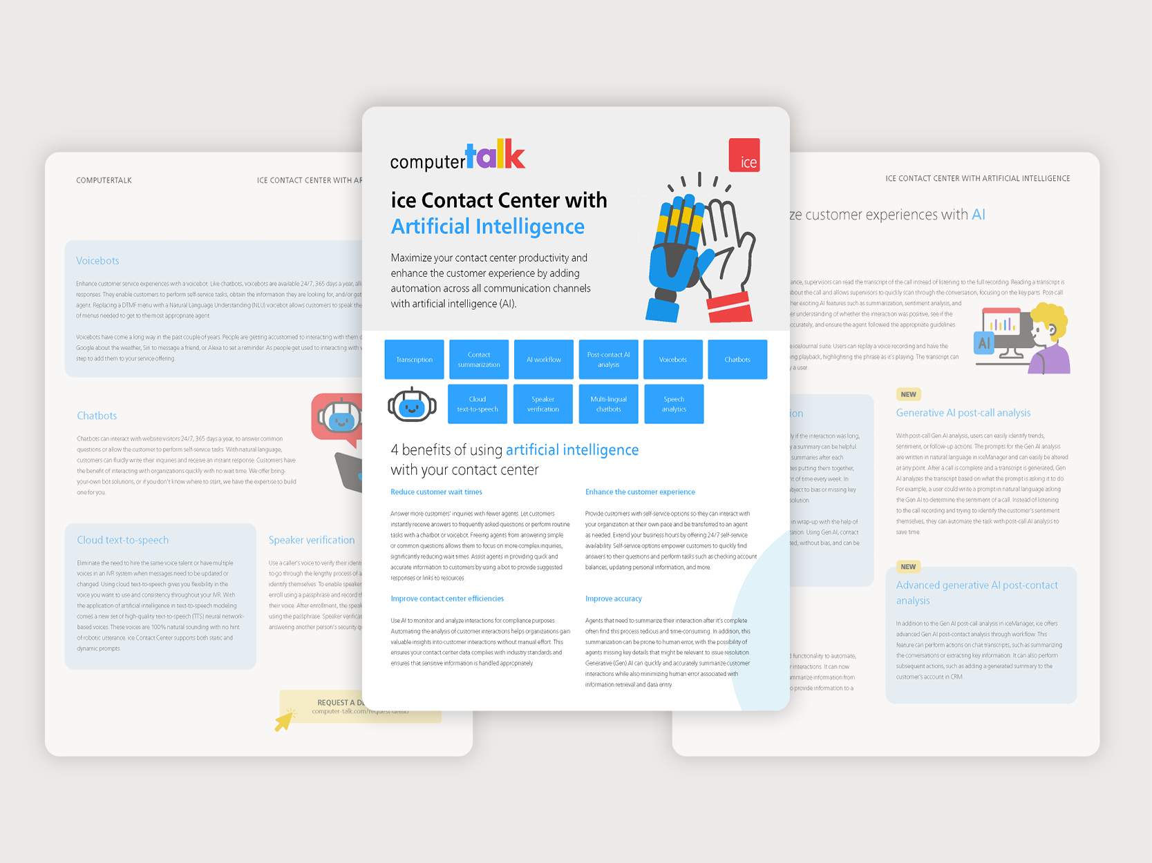
To balance flexibility with brand consistency, I developed a series of reusable templates tailored for various scenarios and functions. These templates streamlined communication while ensuring a cohesive visual identity across all materials.
Modular Website Components – Designed various website modules to ensure that key design elements and layouts remained consistent across all web pages.
Email Templates – Designed for marketing campaigns, newsletters, and internal communications.
Presentation Templates – Created for sales pitches, project updates, training sessions, and company-wide meetings.
Document Templates – Standardized formats for reports, proposals, meeting agendas, and contracts.
✅ Modernized Logo Design
As part of the rebranding efforts, I designed a modernized logo that better reflected the company's evolving identity. The updated design aligned with the refreshed brand strategy, ensuring a professional, cohesive look across all platforms. The colors chosen for the logo were intentionally selected to represent the core values that resonated most with the company. Each hue reinforced the brand’s identity, creating a visual connection with its values.


